The Rise of Minimalist Web Experiences
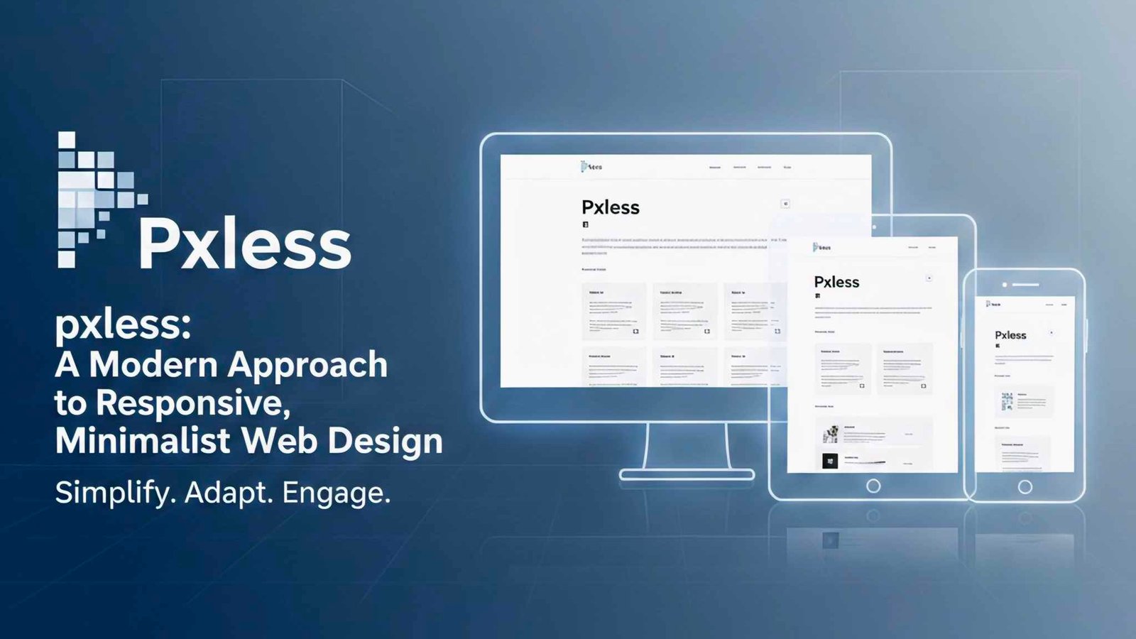
In today’s digital world, users expect clean interfaces, fast loading speeds, and seamless mobile responsiveness. This shift has given rise to design philosophies that prioritize simplicity without sacrificing usability. One such emerging concept is pxless, a mindset focused on designing layouts that rely less on rigid pixel measurements and more on fluid, scalable structures. As modern devices continue to vary widely in screen size and resolution, this approach helps designers create experiences that feel natural everywhere. By embracing flexible units, adaptive typography, and intuitive spacing, developers can build websites that outperform traditional pixel-bound designs in both speed and aesthetics.
Understanding User Expectations
Consumers want clarity, speed, and functionality. When layouts break or feel cluttered, they leave. The pxless philosophy encourages using adaptable design foundations like percentages, rem units, and dynamic grid systems to craft interfaces that evolve with the screen. This leads to fewer breakpoints, less CSS bloat, and a more harmonious user journey.
Why the pxless Philosophy Matters Today
Design trends have shifted dramatically over the past decade. Pixel-perfect layouts once ruled the web, but they’re no longer ideal for modern, multi-device experiences. The pxless approach helps solve this by focusing on flexible principles instead of fixed values. It also plays well with performance-driven design strategies, search engine optimization, and accessibility guidelines.
Performance and SEO Advantages
Search engines reward websites that load quickly and adapt gracefully across devices. When designers stop relying on heavy pixel-based adjustments and instead use fluid techniques, pages render faster and more consistently. This helps reduce cumulative layout shift (CLS), a vital factor in Google’s Core Web Vitals.
More Accessible Web Experiences
Accessibility is no longer optional. Scalable units allow for better support of zoom adjustments, custom user settings, and assistive technologies. When designers adopt a pxless mindset, they create interfaces that adapt to human needs—not the other way around.
Core Principles of pxless Web Design
The pxless approach is not about eliminating pixels entirely. Instead, it’s about rethinking how dimensions are applied. It focuses on flexibility, adaptability, and minimalism.
Fluid Layouts
A fluid layout responds instantly to the screen size, maintaining visual harmony without constant breakpoints. Designers use relative units like percentages or viewport-based measurements to make container widths and heights adjust smoothly.
Scalable Typography
Typography is one of the most powerful elements of any interface. Scalable units like rem or em allow headings, paragraphs, and buttons to expand or shrink naturally across resolutions. This avoids awkward text wrapping or oversized fonts on small screens.
Simplified Spacing Systems
Rather than relying on dozens of pixel-based padding and margin rules, a simpler spacing system aligns with the pxless philosophy. A modular scale using rem or ch units can unify spacing across the entire design, improving consistency and reducing CSS complexity.
Implementing pxless Techniques in Real Projects
Adopting a new design philosophy can seem overwhelming, but the transition is much easier when broken into actionable steps.
Start With a Flexible Grid
Use CSS Grid or Flexbox to structure your layout. Both systems support dynamic resizing and allow elements to respond intelligently to different viewports.
Replace Most Pixel Values
While you don’t need to eliminate all pixels, start replacing them with rem, em, %, or vw/vh where appropriate. Buttons, form fields, typography, and containers benefit greatly from this change.
Test Across Devices Early
One of the best ways to refine a pxless approach is to test on actual phones, tablets, and desktops from the beginning. This ensures spacing, scaling, and proportions feel consistent and intentional.
Common Mistakes to Avoid
Even with best intentions, designers can make errors when transitioning to a pxless mindset.
Overusing Viewport Units
Using too many vw or vh units can make text excessively large on small screens or tiny on large displays. A balanced combination of rem and viewport units helps maintain readability.
Ignoring Content Prioritization
Flexibility doesn’t mean randomness. Designers should still prioritize hierarchy, spacing logic, and visual balance. Without thoughtful planning, a flexible layout can feel chaotic instead of clean.
FAQ
What does “pxless” mean?
It refers to a design mindset that uses fewer pixel-based measurements and more adaptable, scalable units.
Is pxless design mobile-friendly?
Yes. It’s built around responsive principles, making interfaces naturally suited for mobile screens.
Do I need special tools to design pxless layouts?
No. Standard CSS units like rem, %, and vw/vh are all you need.
Can I still use pixels sometimes?
Absolutely. The pxless philosophy encourages flexibility, not strict rules.
Conclusion
The pxless approach represents an evolution in modern web design—one that focuses on fluidity, simplicity, and adaptability. As devices continue to diversify, rigid pixel-based layouts become less practical and less user-friendly. By embracing scalable units, flexible grids, and streamlined spacing systems, designers can create experiences that look beautiful on every screen. Whether you’re building a personal blog or a complex application, adopting a pxless mindset can help you improve performance, consistency, and accessibility across your entire digital experience.


